Redesign of web-app to improve business efficiency — Disciplina.ru
Disciplina is a product of KT-labs company, that lets you know how your employees manage time, how many employees is loaded with work and how many employees spend time in office.
Client
KT labs is a company that develops information systems, web-based applications, services and mobile apps.
Task
Make redesing of time management software.
Output
Mockups and guidelines for new interface for disciplina.ru
Team
UI/UX Designer: Pavel Kuligin
Disciplina is a product of KT-labs company, that lets you know how your employees manage time, how many employees is loaded with work and how many employees spend time in office.
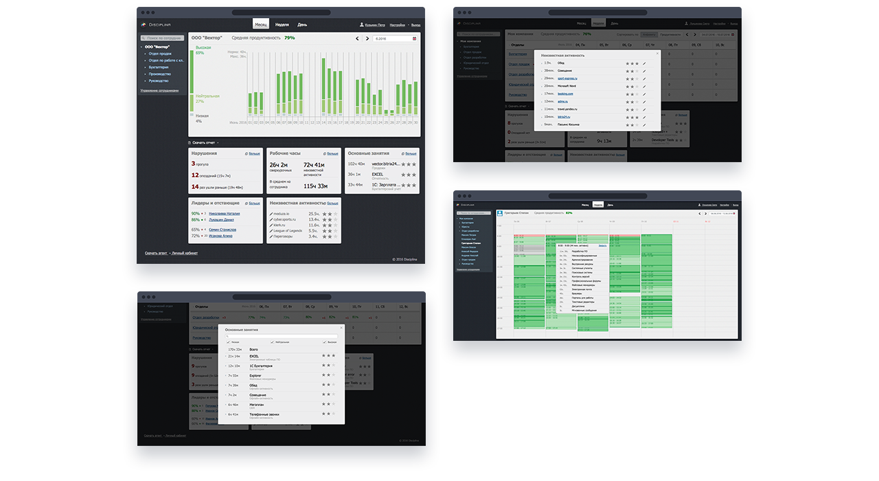
Team of Disciplina identified critical issues of product after a year of implementation at the major customers in Kazan:
On basis of problems identified, audit and competitor analysis of interfaces I wrote and approved understanding of problems and the task to work. According to schedule I had to finish in 2 months. Spoiler: I did not succeed.
In the task to work we fantasized with CTO on the topic of deep machine learning to score efficiency of employees, as well as integration of product with variety of third-party solutions from CRM to call tracking. But these thoughts were not included in design and the first version of updated product.

Most product problems was associated with poorly built navigation. So the first thing I took up the UX-design of new structure and functional description of reports:

Catalog activities was most reworked, now it’s divided on catalogue, unknown activity and search module. From the old version I kept columns interface solution that is similar to one of the forms structure in Finder on macOS.
Dashboard iterations
I worked in Sketch and Invision. The basis of product — presentation of data, so I concentrated on dashboard to approve the general concept and functionality. After a few iterations, we had come to solution that satisfied me and the whole team.


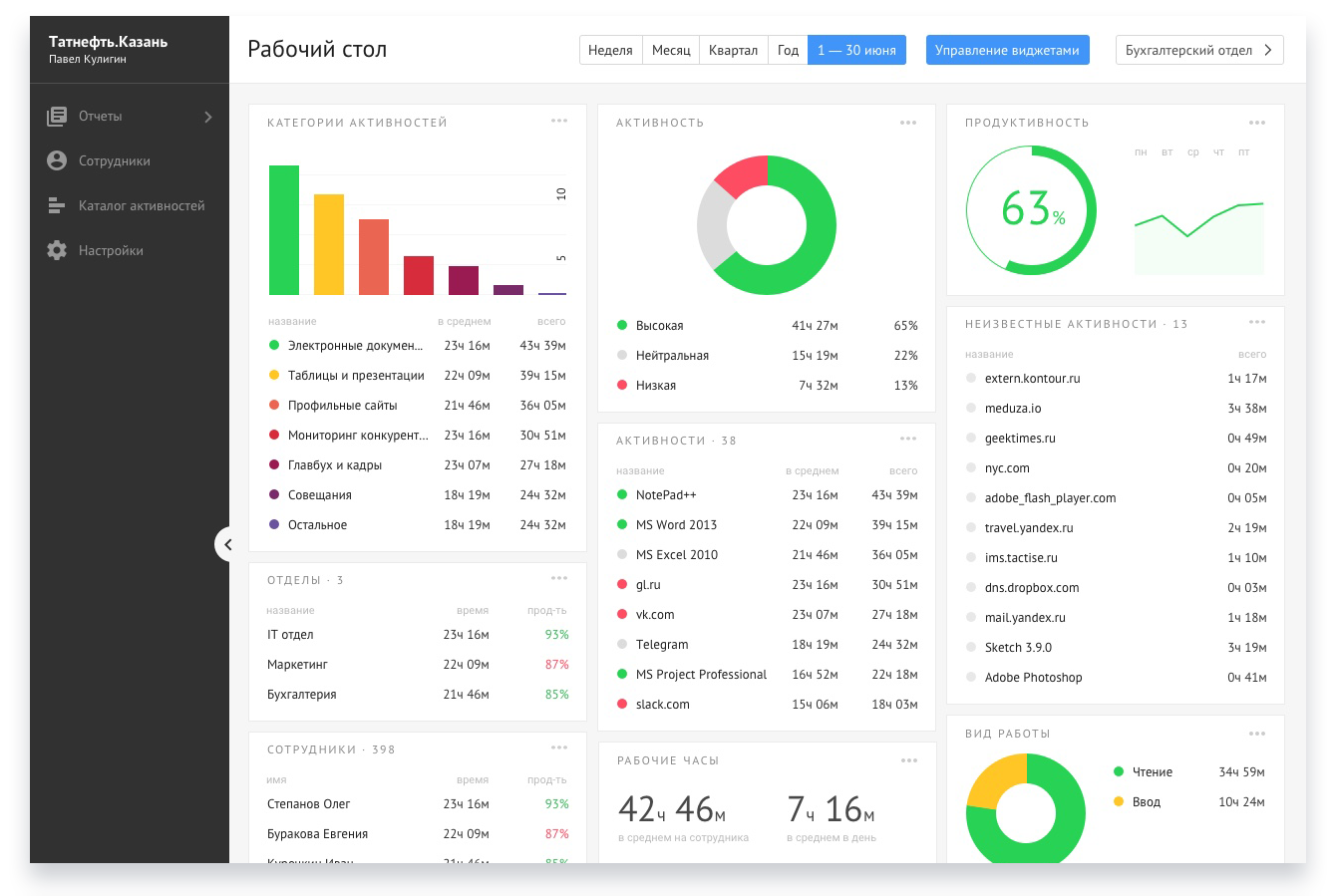
Dashboards developed from concept to corporate and filled version of the system for a week
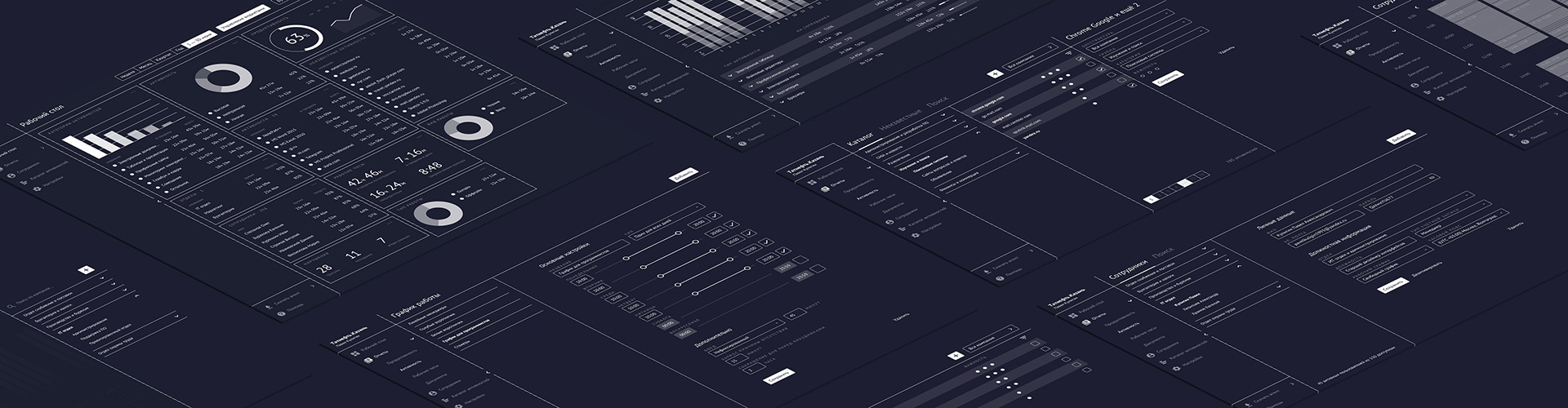
As a result, I did 4 iterations and 46 interface screens. Each iteration was accompanied by an interactive prototype in Invision for transitions and evaluation of key scenarios.
Moving into design stage took a whole month, as the team took a break for approval and testing users. Approved version became basis for main pages: Reports, Settings, Staff Schedules.
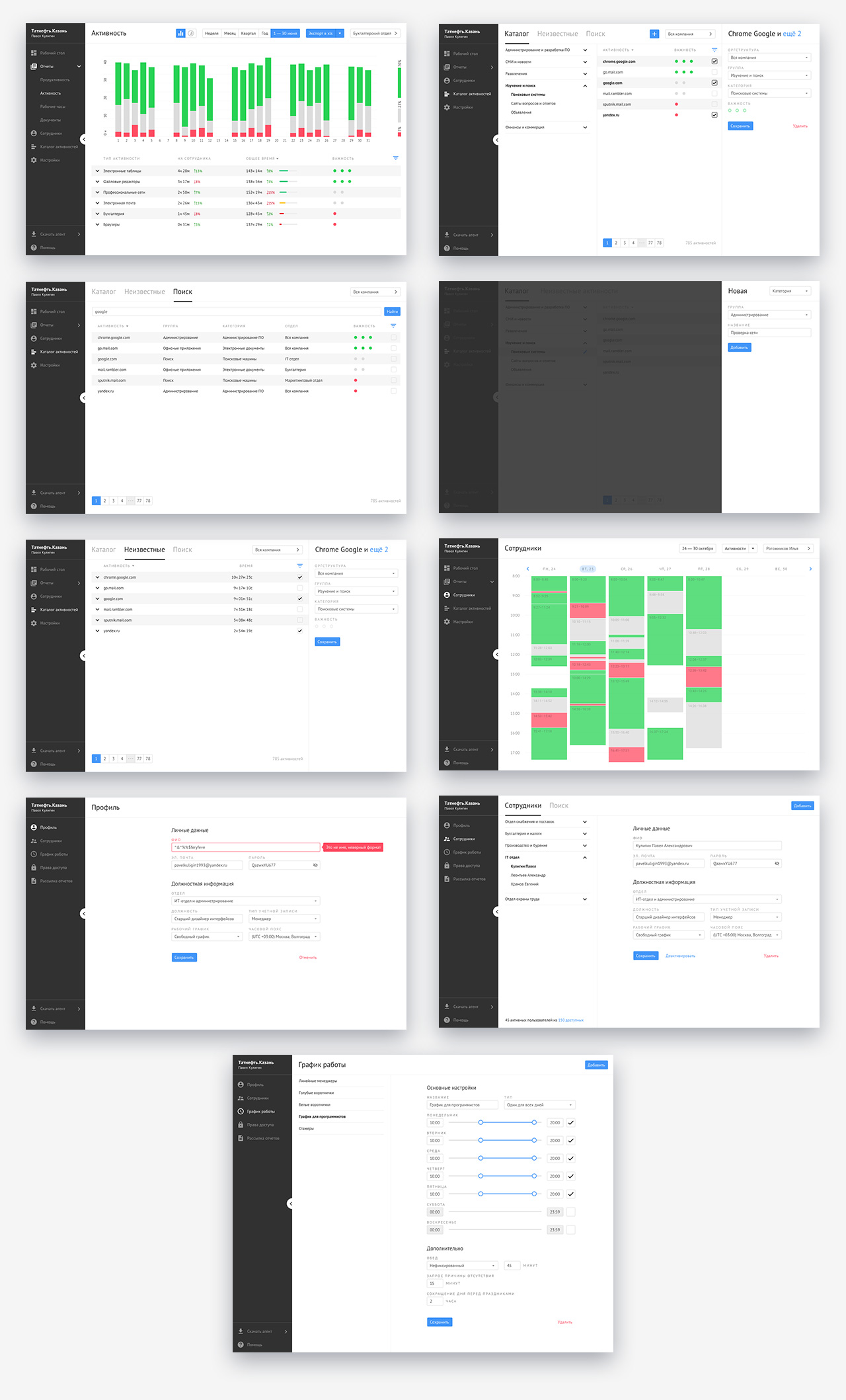
One of the findings was front-side panel, which allowed me not to use popups and dialogs.

After approving all scenarios and screens I prepared UI kit for front-enders. The next step will be supervision of implementation of new product version.
